UPS Heuristic Evaluation
Brain station Class Project
UPS Webpage sign up flow redesign based on the Nielsen Norma Group Usability Heuristics. I worked with one other designer (Madhuri Krishnamurthy).
My Role
UX Researcher and Designer
Duration
Two weeks
Tools
Figma
Heuristics Evaluation Overview
Task Selection
As a team we decided to redesign the UPS website because of its global footprint and users in virtually every country. We then chose to focus on the sign up flow as it is an integral experience for a user as they are first navigating a website. If the user has a bad experience during the sign up process they user could build distrust with the company and potentially go to a competitor site.
Heuristic Violations
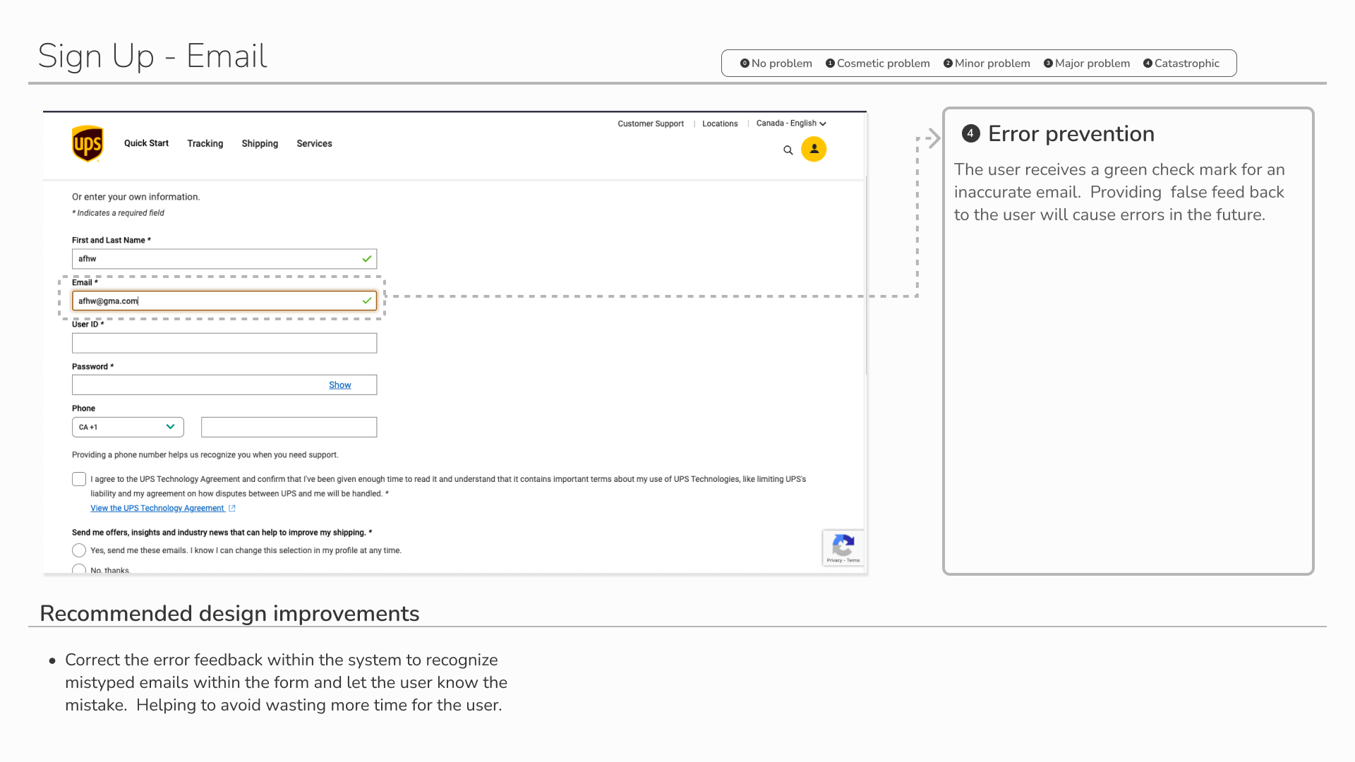
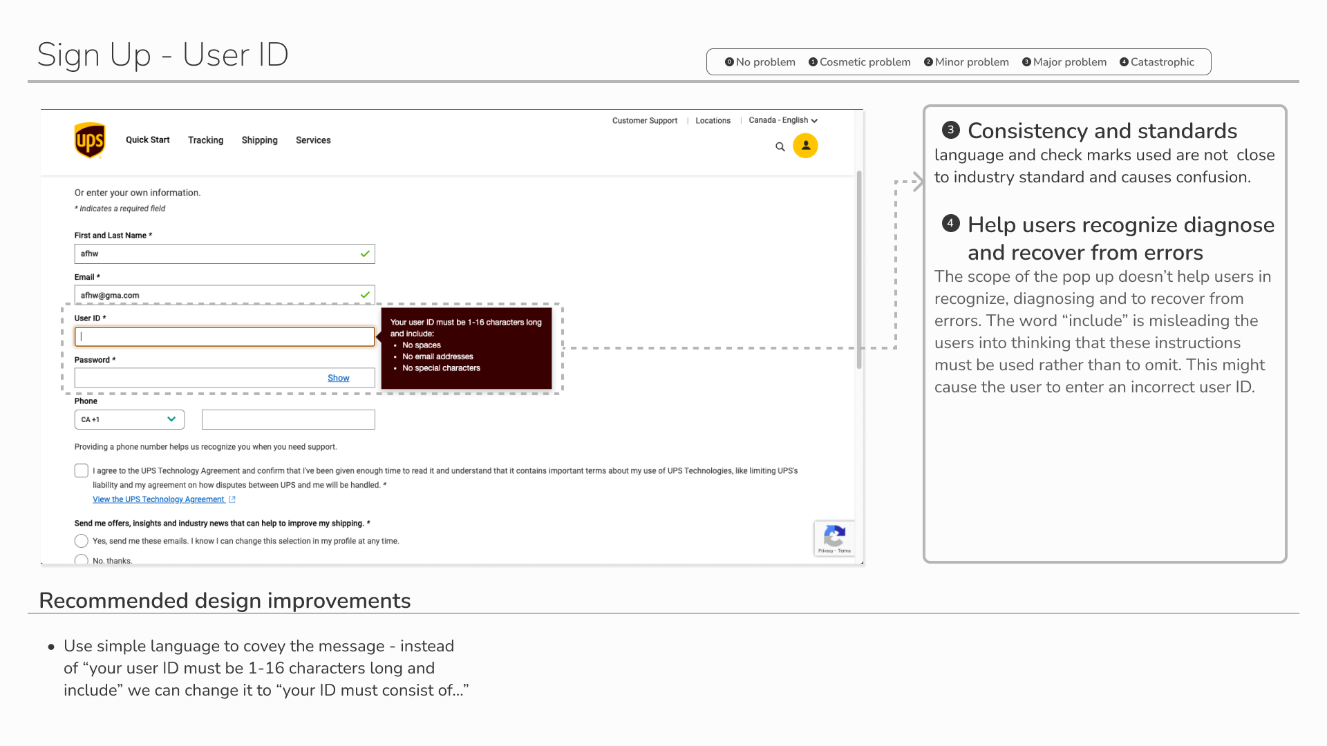
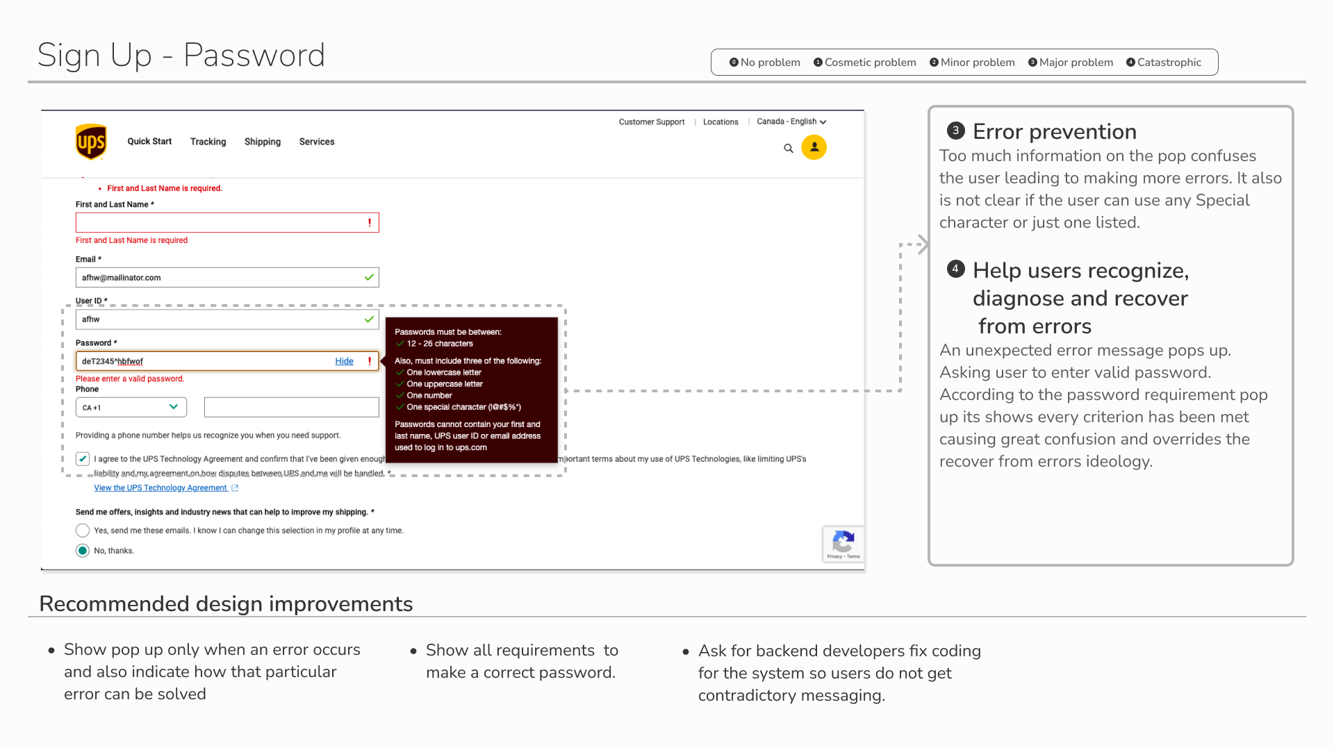
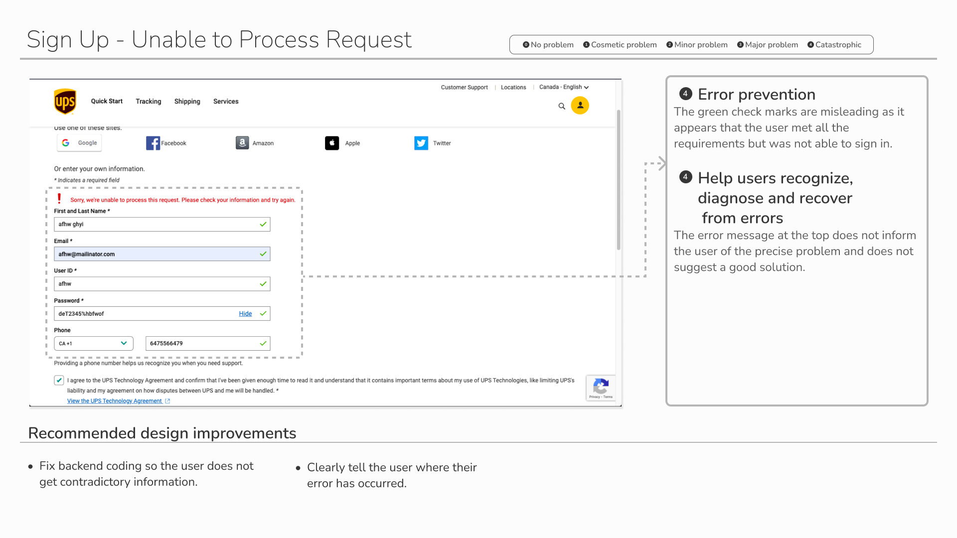
Using the Nielsen Norman Groups 10 Usability Heuristics, We found many problems during the experience of signing up on UPS’s website. These were the top 5 Violations:
Error Prevention
Consistency and Standards
Aesthetic and Minimal Design
Recognition Rather than Recall
Help Users Recognize, Diagnose and Recover from Error
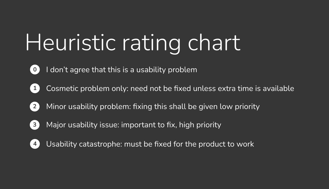
Severity Scale
For each violation identified, we evaluated the severity of the issue using a severity scale which ranged from 0 to 4. This severity scale helped us to prioritize and address the most pressing problem areas.
Branding Constraints
For this process we wanted to entirely focus on the usability of the website so we adhered to the existing color palette and topography of UPS. We sought to ensure that our design solutions were consistent with UPS brand guidelines.
Heuristic Evaluations
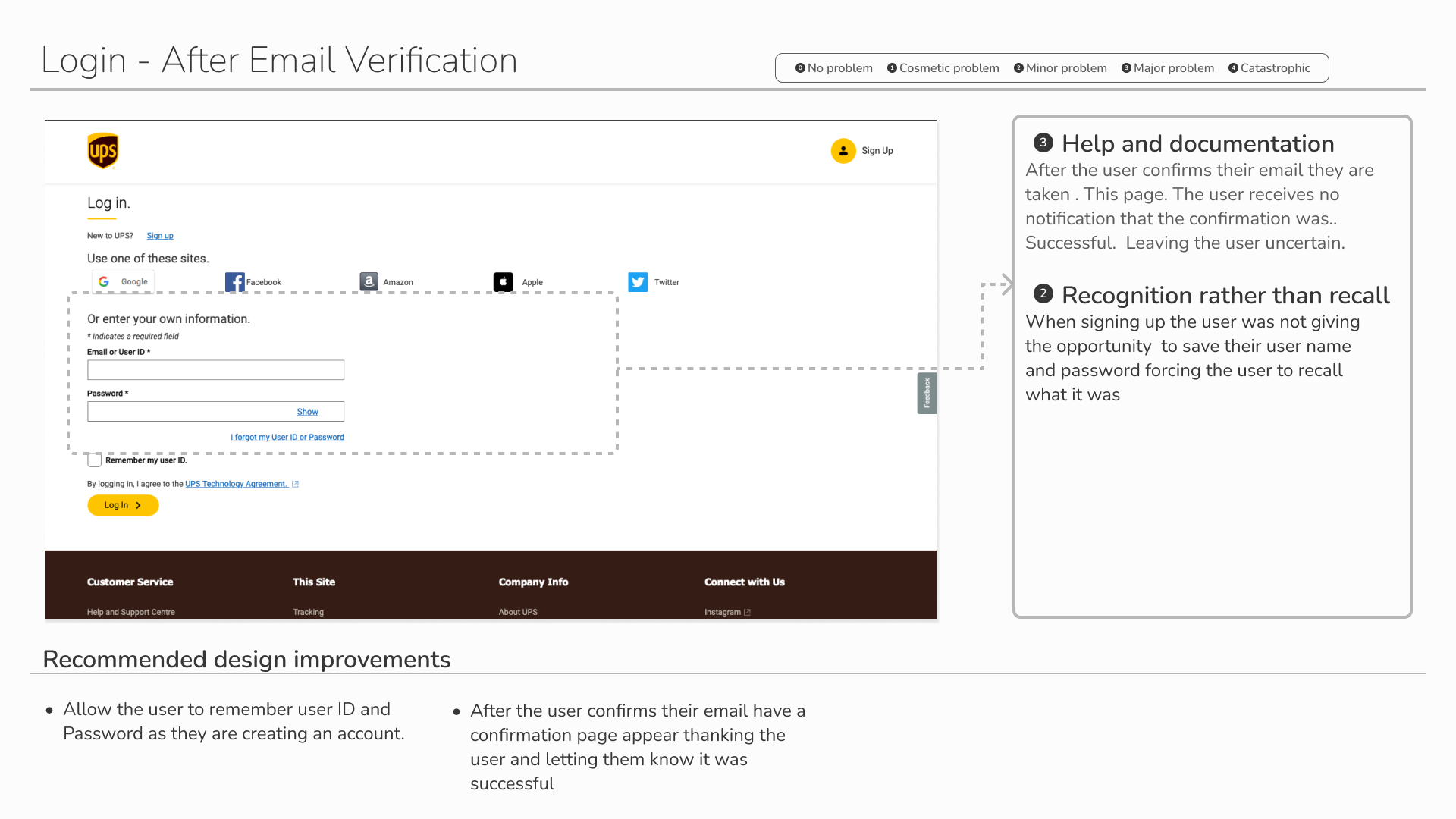
Our first task was to review every step of the sign up process and record all of our observations and experiences. We then made design change recommendations based on the Heuristic Evaluations. Below is the process a user experiences when signing up for UPS.
Design Prioritization Matrix
We organized the recommended changes on a design prioritization matrix helping us see what the most important design changes will be. We wanted to focus first on the low effort, high impact changes as these will have the greatest impact at the lowest cost for the company.
Redesigning the Screens
With our opportunities for improvement laid out, it was time to start redesigning! We decided to make the most impactful changes first and then made our way through the matrix. Overall these usability issues ranked from minor cosmetic problems to major usability problems.
Before
Issue
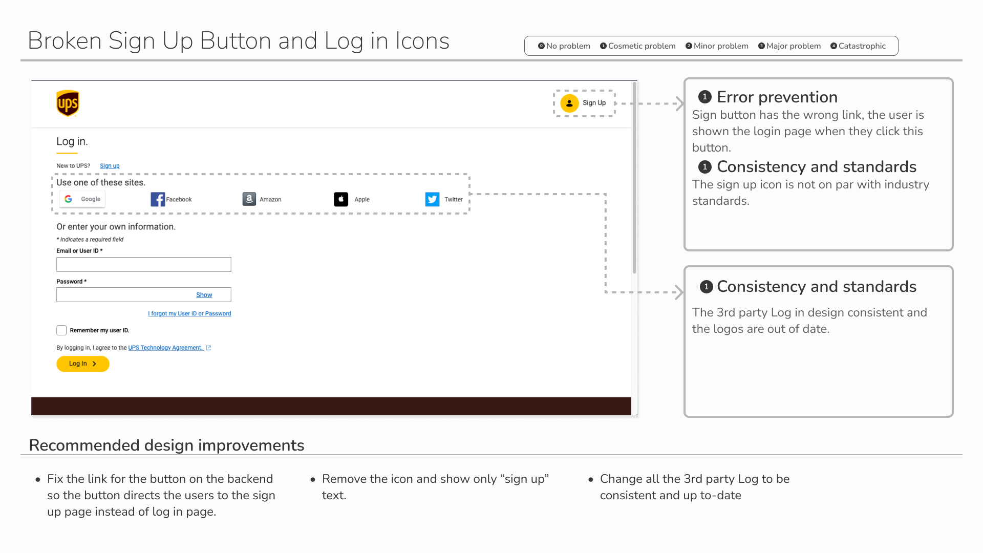
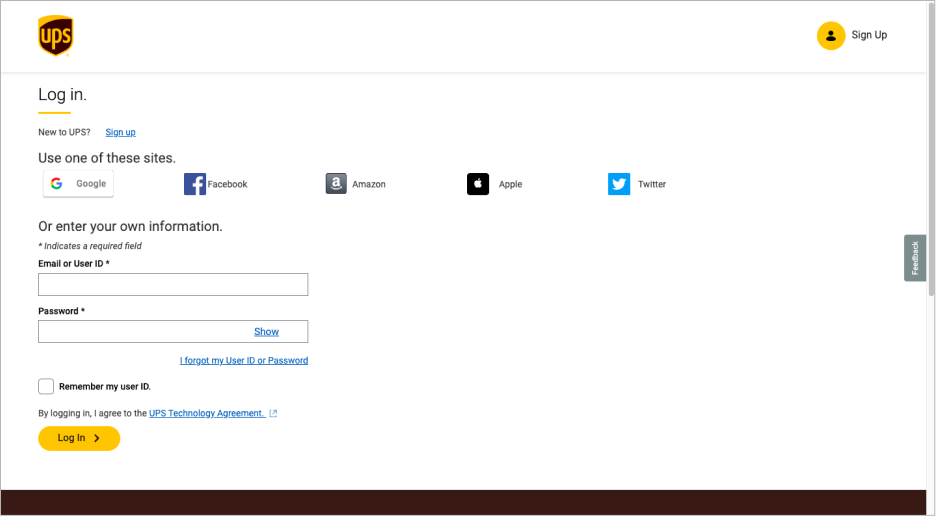
The sign up icon is not the correct icon to use.
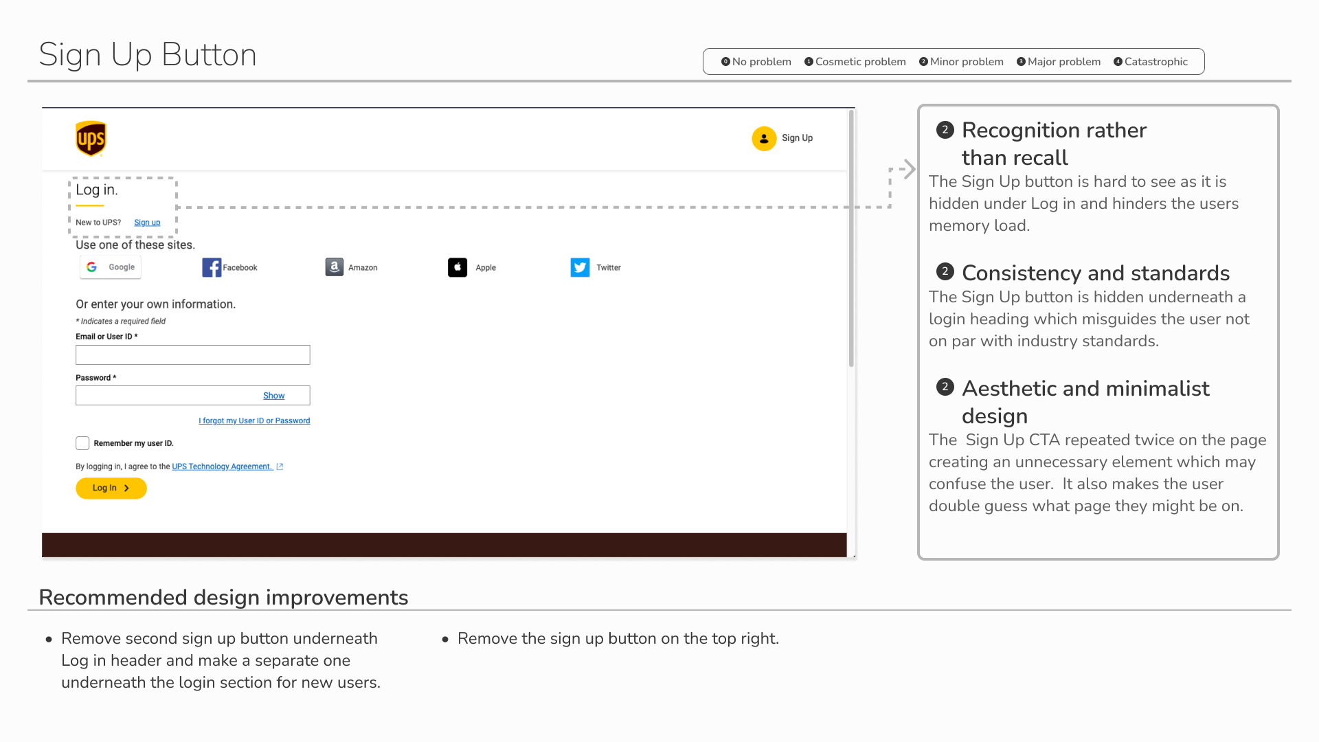
The sign up button is hard to see as it is hidden under Log in and hinders the users memory load.
The third party login icons are not uniform.
The content is not aligned.
Show password in blue color is misleading making it seem like it would take you to a different webpage.
After
Solution
Improved the hierarchy of text so it is more readable and log in is easier to find.
Made all of the 3rd party Log in design consistent and up to-date
Changed the show button to grey - the blue underline is inaccurate color to use.
Added navigation bar to keep it consistent with the rest of the website.
Align content - remember my user id and forgot password/email.
Log in
Violation of Heuristic : Recognition Rather than Recall, Consistency and Standards, Aesthetic and Minimalist Design
Sign Up
Violation of Heuristic : Recognition Rather than Recall, Consistency and Standards, Error Prevention
Before
Issue
After
Solution
Having user create user ID is unnecessary and redundant step for the user.
3rd party log in are inconsistent.
Incorrect icon used for Log in.
First and last name is not culturally inclusive as some people do not have first and last name.
Removed User ID to make the sign up process easier for the user and allow the user to recall less.
Made all of the 3rd party Log in design consistent and up to-date.
Made hierarchy consistent to look like log in.
Added Log in name tag for the top button.
Changed “first and last name” to “full name” to reduce errors and to make it inclusive.
Sign Up - Name
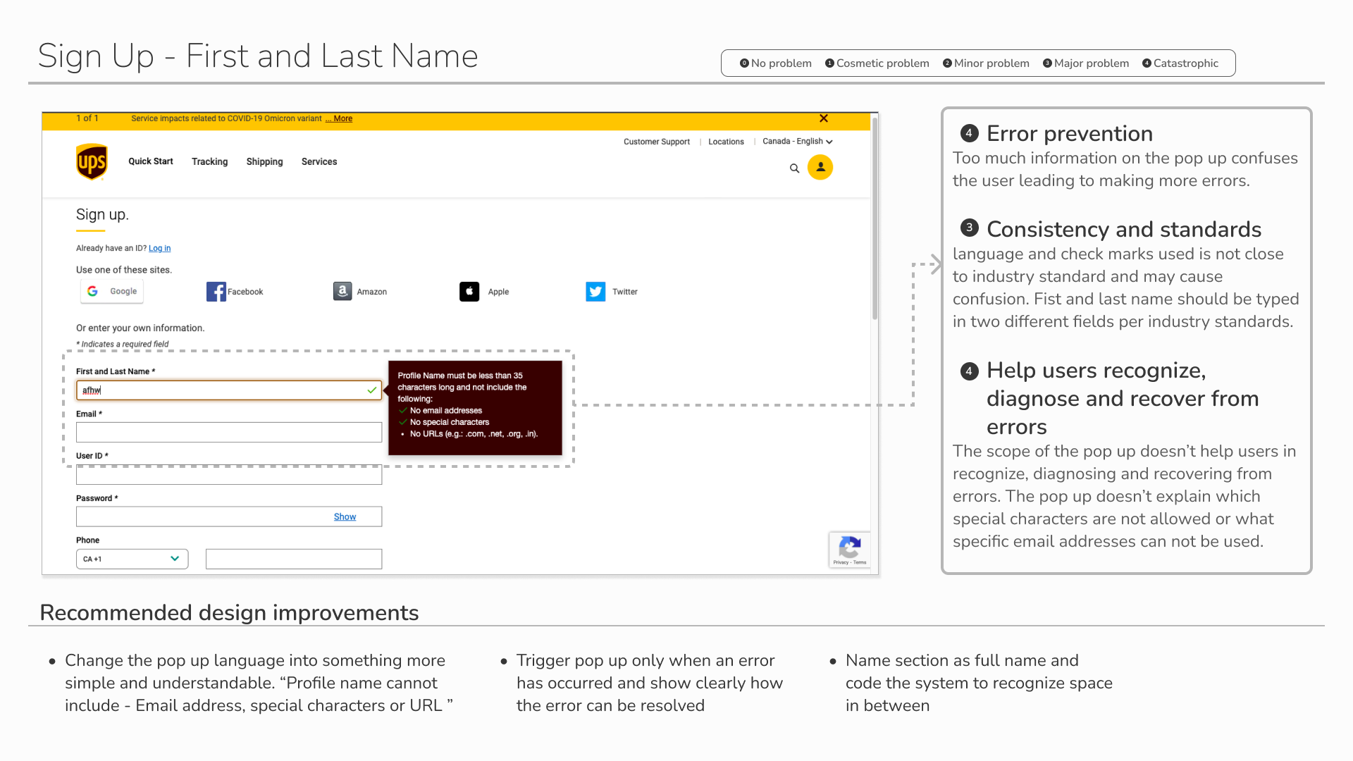
Violation of Heuristic : Error Prevention, Consistency and Standards, Help Users Recognize, Diagnose and Recover From Errors
Before
Issue
Confusing name requirement pop up appears when user clicks on text box.
After
Solution
Remove confusing name requirement pop up.
Change the active box state to grey to create a more consistent and minimal design.
Message will only appear when the user makes a mistake.
Password
Before
After
Issue
Solution
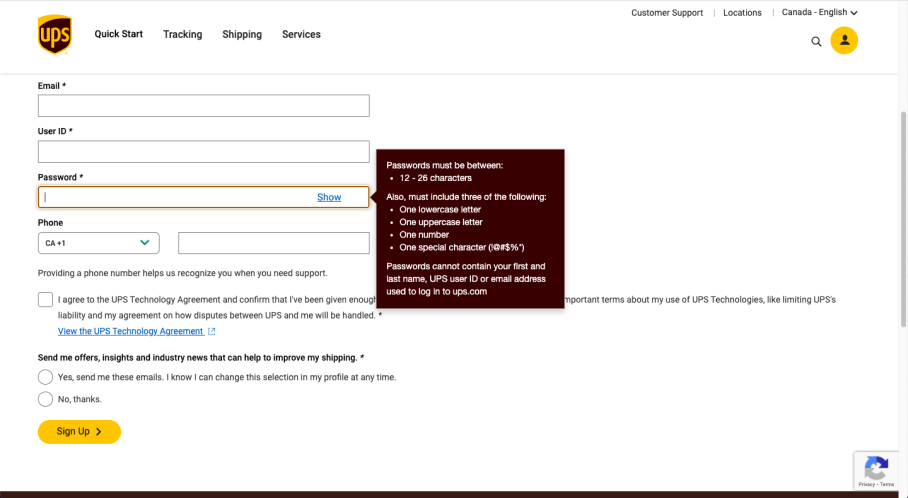
Too much information on the pop up confuses the user leading to making more errors.
Clearly show when the user meets password requirements.
Added eye icon for accessibility to clearly show that they user can show the password they created.
Violation of Heuristic : Error Prevention and Help Users Recognize, Diagnose and Recover From Errors
Violation of Heuristic : Constancy and Standards
Before
Issue
The email confirmation design doesn’t match the rest of the website design. The grouping and visual hierarchy is poorly laid out and hard to read.
After
Solution
Decrease spacing between vertical content.
Used different font size and boldness to show visual hierarchy.
Used styles previously used on the websight.
Conclusion
Design Impact
Our team was able to resolve the most important tasks on our Design Prioritization Matrix. The UPS redesign provides a more user friendly experience. With this, we hope to alleviate the common frustrations during the sign up process like confusing password and name requirements as well as making the over all website more consistent.
Key Learnings
Conducting this heuristic evaluation made me more aware and appreciative of usability design. I learned the importance of making sure the user clearly understands what is happening and what the issues are. I also learned the importance of consistency throughout the website and with industry standards. If you are not consistent this could leave the user confused.

