Community Share
BrainStation UX Part time Bootcamp|Capstone Project Case Study
Community Share was created to provide a solution to two major problems of our time: overconsumption and environmental degradation.
This app allows users to list items that they are giving away for free or create postings for items that they need. This app then creates a direct match between the giver and the receiver. By creating a direct match, users save money and the environment by not making unnecessary purchases and creating waste through the production of goods. To create this app, I used the human center design framework as this gives an added user perspective.
My Role
User Researcher, UX/UI Designer
Duration
7 Months
Tools
Figma, Invision
Methodology
To tackle this problem I used the Design Thinking Process as this allows me to create human centered design and always keep the user in mind.
Discovering the Problem
I've grown up on the East Coast and have seen the effects of climate change on our oceans and communities first hand. I am very passionate about finding ways to help the environment become more sustainable. My goal is to see how technology can be used to help the environment.
It would make me very upset as I drove around my community and saw perfectly good things put out on the street to be thrown away. Possible members of the community could utilize and recycle these goods, but instead they will end up in the landfills and in turn cause environmental harm. This experience led me try to understand how American families consume goods and what we as a community can do about it.
Secondary Research
Environmental Impact
To begin with, I wanted to understand the environmental impact of overconsumption and waste.
I found that over the past century a lot has changed in developed countries as our economic and social foundations are built on materialism and consumption. To meet consumption demands we have used an abundance of natural resources and burned fossil fuels which lead to environmental degradation. Western culture has a linear material economy, where materials are extracted, made into goods, and disposed of. This is a one-way street that creates massive environmental and public health impacts. Greenhouse gas emissions are created in the process of extracting resources, producing goods, disposing of waste, and transporting materials at every stage of that process.
-

The US creates 4.4 pounds of waste per person per day
-

728,000 tons of daily garbage
-
19.5 % of items that are thrown away are durable goods
-
We are on track to run out of landfills within 18 years
Secondary Research
Benefits of Sharing
I then did research into sharing resources.
I found that sharing helps people to interact in a meaningful and pleasant way that builds community. In addition when you depend on and assist one another, it creates a real sense of belonging, teamwork, and shared destiny when you are able to trust in and depend on each other. A survey at Harvard Business School in 2008 showed that when one gives away a sum of money, it helps lift his own well-being more than if they spend it on themselves. Through sharing resources, information and knowledge we as a nation can saves time and energy.
Research shows that when you give to others, it has a positive impact on your brain and triggers dopamine that will improve your mood.“How Might We…”
After seeing this research I believe that to help solve this overconsumption problem we need community resource sharing which includes sharing of physical resources, services, and skills. This will help decrease the aggressive level of consumption that many countries are facing.
How might we help suburban families combat overconsumption through community sharing in order to help fight against climate change.
Primary Research
User Interviews
To help me understand the “why” behind my problem I conducted interviews with suburban families. I wanted to understand how these families consume new vs. old products. This included learning about their shopping habits as well as their thoughts on donating and buying items second hand. I also want to learn how these families communicate with the community to better understand what relationships with their neighbors are like. I asked questions about their shopping habits, shopping secondhand, donating, throwing away durable goods, repurposing, recycling, and community involvement.
Method
Six one-on-one 40 to 60 minute zoom interviews
Criteria
Lives in the suburb
Has 3+ people living in their house
Has donated items in the past year
Assumptions to get validated
Many people do not want to spend time looking for items second hand
Households often have unused tools that other families could utilize
Some households will not feel comfortable sharing their things with other families
Many families throw away valuable items
Affinity Mapping
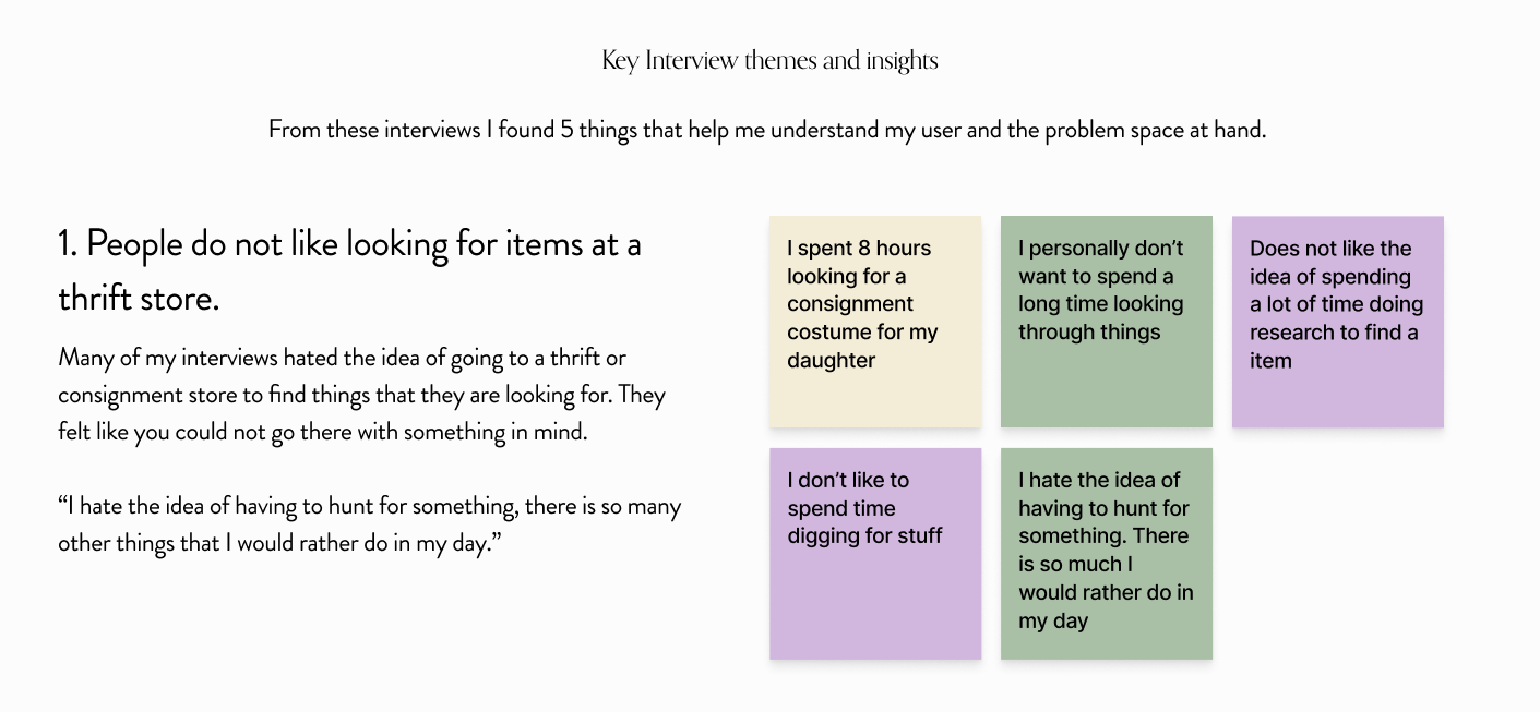
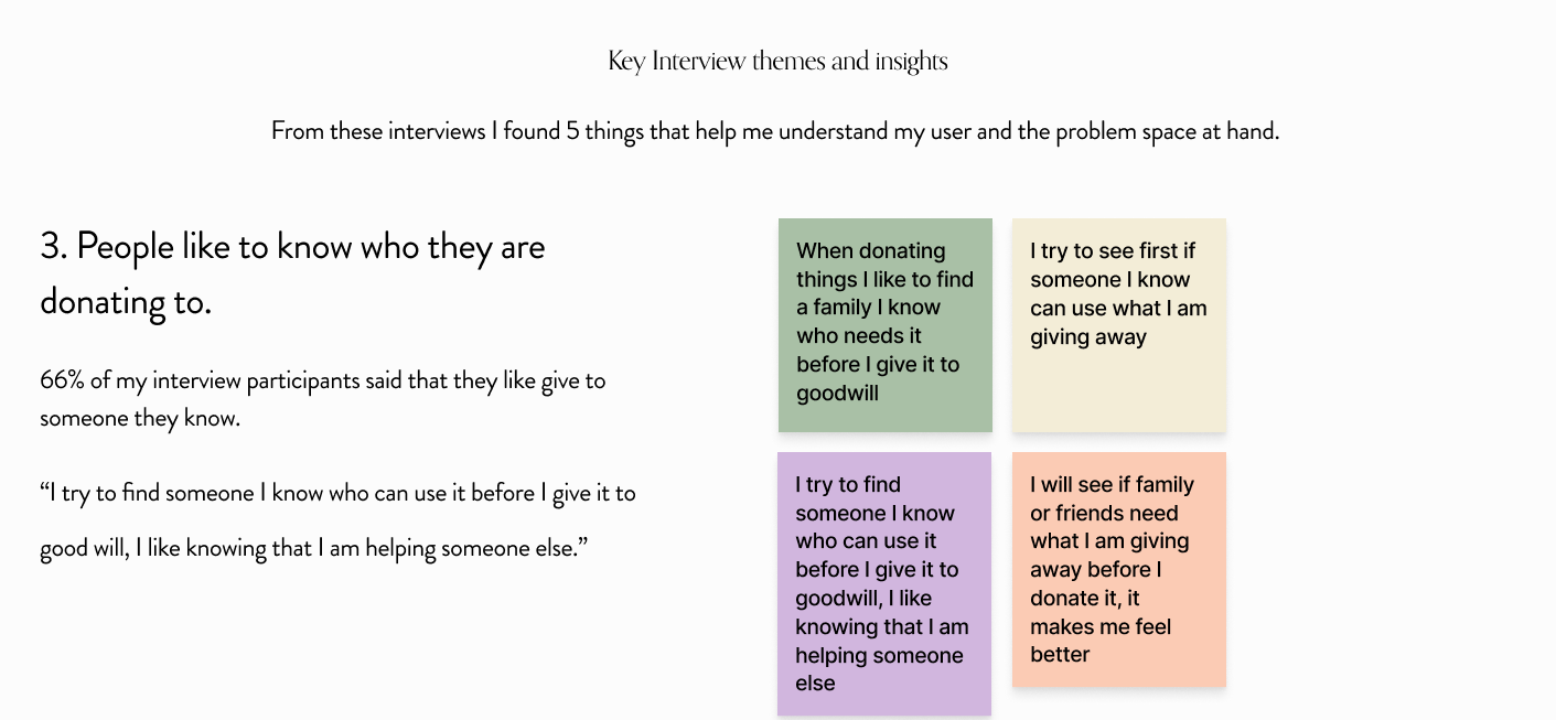
After I conducted my interviews I sorted all of my feedback into an affinity map. This helped me organize all of the insights that I discovered from the interview by grouping based on similar feedback.
From these interviews I chose to focus on 5 key Insights:
People do not like looking for items at a thrift store.
People like to know who they are donating to.
People try to donate often and some rather give than sell.
People do not have a lot of communication with neighbors and do not desire close relationships.
People feel like inventory at thrift stores is less than ideal.
Reframing the Problem Space
Based on these interviews I came to the conclusion that people like to donate and help others, but are less inclined to get things second hand as there are inventory problems at thrift stores. People often do not have close relationships with neighbors, so actively sharing personal goods seems like an overwhelming task. Therefore, I decided that I wanted to focus on finding a way to make it easier for people to utilize second hand options instead of participating in consumer culture.
Persona
From these interviews I could better understand my user goals, pain points, and motivations. I created a user personal that emulates these common themes and characteristics that I saw. This will help me always keep in mind who I am designing for. I want to be sure that I am always targeting my users goals and pain points.
User Experience Map
Using Hanna, I created an experience map that helps me understand the end-to-end experience one might have while trying to replace a house hold item. When I put myself in the shoes of the Hanna I was able to see the opportunities for improvement that I highlighted in red. For my experience map I chose to focus on what Hanna would go through trying to replace her broken vacuum.
Opportunitys
The process of buying something new causes many pain points for Hanna as she is actively trying to reduce her carbon footprint. I found that there was opportunity for improvement all along the way. Once Hanna decided that she was going to buy second hand, there were problems she encountered. One problem being the thrift store as it did not have what she needed and was not organized well. Shed ended up going to multiple to try and get the vacuum that she was looking for. From this experience I saw an opportunity to help her directly connect to someone who is giving away an item that she is looking for, so she doesn't have to hunt for it. Concluding a need for a second hand sharing platform in her community that is well organized and easy to find.
User Stories
To help me better understand the functionality and features that my digital solution will need, I created 30 user stories from the perspective of Hanna I clearly saw that there were two main users, a Giver and Receiver. I decided to focus on the receiver, because my user interviews showed that there is a greater challenge finding used items than giving items away. I then broke the Receiver into four Separate Epics - Finding Items, Matching/Favoriting, and Communication/Information as they are all important aspects to create a listing marketplace application. Therefore I decided to combine essential features from all my epics for my application and the task at hand.
User Task Flow
Primary task
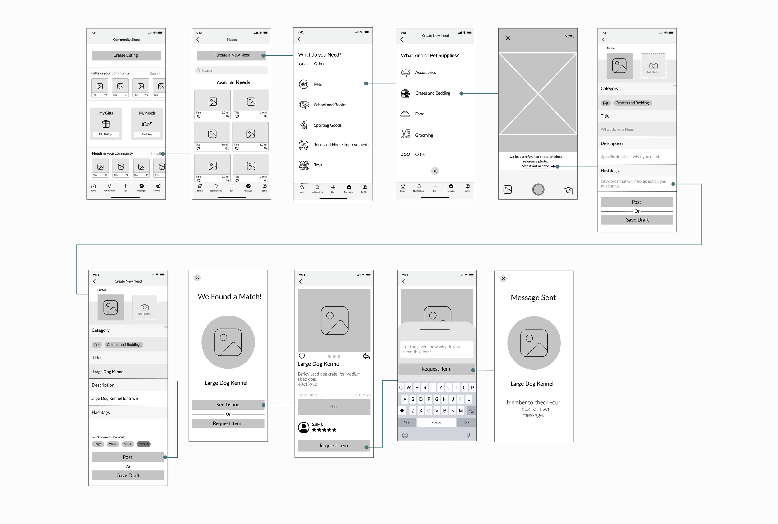
Using the user stories above I decided to focus on the key epic of finding a used item. In this task flow the user is creating creating a need in the app for a for dog crate. This task flow helps me to understand how the user would complete the task with the support of my digital product.
Epic: Find a used Item
User stories: As a Receiver I would like to make a posting for an item that I am in need of so that I do not have to spend time searching for the item
Task: Create a new need post asking for a dog crate
Sketching
After seeing all of my research and gathering all of my inspiration, I now have a better understanding of the problem. I then started to create sketches in the ideation phase. These sketches help illustrate the task flow and help me figure out what UI elements work for my problem. I want to make the listing process similar to what users would have experienced before but also extremely simple so they are not discouraged from listing an item.
I first looked to other apps and UI components to gather inspiration. I considered apps where people list their own items for sale, such as Mercari, Facebook MarketPlace, Kijiji, and Tradesy. I also looked to dating apps as I wanted to take inspiration from their matching notifications.
Lo-Fi Wireframe
Using elements for my sketch I came up with my first iteration of my prototype. Below is the Low-Fi flow of a user of creating a new need for a dog crate in the community share app.
User Testing
As a part of my design process, I conducted two rounds of usability testing with five participants each round. These were all first time users with no experience using the app. I first asked the users to explain to me how they interpret the home screen without any context given to what the app is supposed to do. I wanted to truly understand how the user understands and interprets the home page. This will help me gain real time feedback that can help improve my design and allow me to make a more user friendly experience. The users were then asked to complete a set of 4 tasks throughout the process of creating a new need for pet supplies.
Tasks
See all gifts in Community
Create a Need for Pet accessory
Change Need to Pet Crate and Bedding
Edit Previous Need Post
Home Page
Problem
Users found this home page to be overwhelming and it was difficult to understand what the app would do. Users were confused as they could not tell where they were in the app based on the title or the nav bar. The cards and titles were very small and hard for the user to read. Overall the page felt very overwhelming to the user.
Solution
Provided the user with more context into what Gifts and Needs are so a new user is less lost
Made the cards larger to help readability for the users
Add the location so the users know where they are looking for items
Made the title correlate with where the user is located in the app
Streamline the Nav Bar icons so they are more cohesive
Created more breathing room with in the whole page
Community Needs Page
Problem
Users were confused by the create new need button located at the top of the screen. They found the wording confusing with irregular patterns. Similar to the home page the users felt like the titles were too hard to read. The users were also concerned that they did not have the ability to filter threw postings as this seamed like a feature that they would expect the app to have.
Solution
Removed Create a New Need button at the top of the screen to eliminate confusion and match industry standards
Added filter and relevance feature to help ease of use
Made the cards larger to improve readability
Added request for ease of use
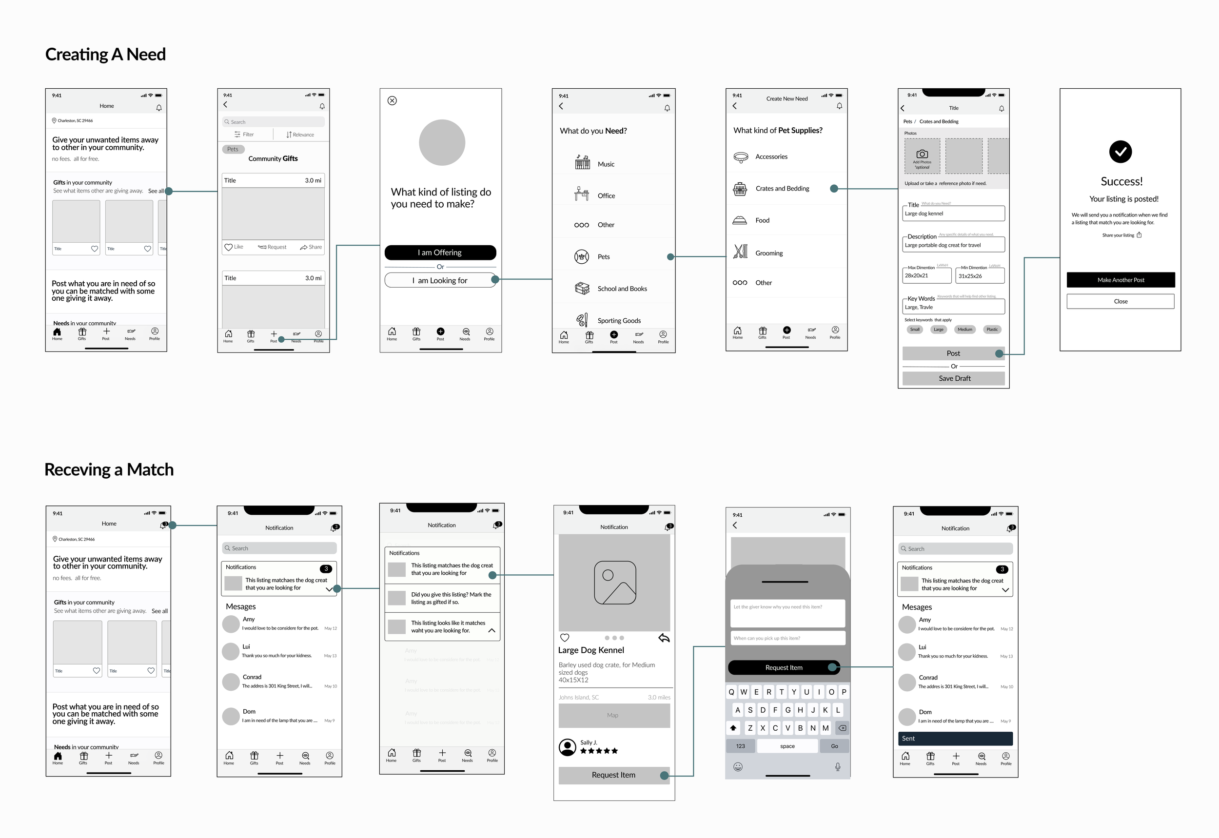
Mid-Fi Wire Frame
After the user testing this is the final Mid-Fi Wire frame
Creating New Need
Problem
Users were confused when the flow automatically took them to a page where they would upload a reference photo for the posting. It felt unnecessary as they believed they would not always like to upload a photo. Users felt like the photo section felt detached from the rest of the form field, and some users even forgot that it was a part of the flow. Some users found the form field to be confusing as it was difficult to tell sections apart.
Solution
Moved the bread crumbs to the top of the page so the photo sections feel apart of the form field
Added copy so the users know that it is optional for the user to upload a photo
Created boxes for the form field so it is easier for the users to read and tell sections apart
Brand Development
Brand Essence
After I made my design improvements it was time for me the translate my grayscale prototype into a High Fidelity. The first thing that I did to help establish my brand identity was create a list of key words that embodied my brand and help define the feeling of the product.
Sustainable - Nature - Kind - Giving - Caring - Community - Supporting - Together - Share -Happy - Eclectic - Vintage
Mood Board
I then searched for images and inspiration using these keywords. With the images that I found I created a mood board that reflected the aesthetic and ambiance that I want to create. I wanted to find images that felt eclectic and antique. As this app will encourage users to use things the are not perfect and new.
UI Library
Wordmark and App Icon
For the wordmark I wanted to encompass the old and vintage feeling that I was trying to achieve through the mood board. I was also careful not want to push it too far and make the wordmark look overdone. I needed to strike a balance between vintage and classic. I tried many different fonts until I landed on one that I liked. I decided that Share should be bolded because I wanted to really make it stand out as that is the backbone for my concept. For my app icon I felt like the brand name was too long, so I needed to create an graphic icon. I wanted something that represents nature as well as coming together and sharing.
Below are different iterations of the word mark with different fonts and case styles.
To help decide on the type face that best fit my brand added the type face options to the images from my mood board.
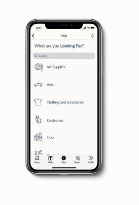
High Fidelity Prototype
After I established the visual identity of my app I began to incorporate these colors and theams into my prototype.
From this, Community Share was born.
Value Proposition
Key Features
Find exactly what you have been looking for, for free!
Community Share allows users to Ask for things that they are in need of so they can easily be matched with someone who is giving it away. The user does not have to spend time searching the internet or resale store looking for the things that they need as they will be directly matched.
Give unused items a new home
You can easily create a post giving away something you think others could use, making sure your item is put to good use and does not end up in a land fill. Consume Less, Reduce Waste, and Help Each Other. Community Share’s goal is to help combat overconsumption by sharing with your neighbor. This cuts down on trash in landfills, reduces carbon dioxide emissions, and creates a community that helps each other and the environment.
Design Impact
Consume Less, Reduce Waste, and Help Each Other. Community Share’s goal is to help combat overconsumption by sharing with your neighbor. This cuts down on trash in landfills, reduces carbon dioxide emissions, creates a community that helps each other and the environment. When someone knows that they need to buy something new for their home, the first thing they should do is post to Community Share to see if some one else is giving away what they need. If this step is added to everyone’s purchasing process, I believe both the community and the environment will benefit greatly.
Next Steps
Build additional flows:
I would like to create the onboarding flow and allow users to make a profile. I think it would be interesting for users to create a profile of clothing sizes and food preferences so they can automatically be matched with listing based off their profile
Explore new features:
I would like to explore the idea of sharing physical products. Is this something users would be open to and what would be the best way to implement this feature?
I would like to see if then we could expand the app with barter services.
Do more user testing:
I would like to do more user testing to help refine my current prototype.
Key Learnings
Design is not and will not be perfect:
I have a tendency to over think things and become obsessive with making what I create perfect. Going through this process I realized that you often just have to jump in and explore ideas. If I worked on project until they were perfect nothing would have gotten done. Every design is not going to be perfect but each design help you learn and grow.
Always ask and think about “Why”:
To truly understand a user you need to ask the “Why”. During interviews asking this simple question helps to reveal the honest answer to the users actions. If you do not dig deep with your users and try your best to understand them you might miss key areas of improvement. It is important to also think about the “Why” in your own process of design to help you know if what you are working on is truly benefiting your end goal.
Stay organized:
When working on a large project like this it is important to stay organized. Things can get overwhelming and lost if you are not on top of your files. Its is important to save and label all iteration of your work so you can go back and compare design changes.
Do not come in with an idea in mind:
It is extremely important to not go into a design with an idea already in mind as you might design for the wrong problem.


